The Brand Edit
About a year into business, Erin came to me with a static logo draft and a desire to refine her strategy and identity. In our session, she shared her vision for tailored florals for brides and corporate events, and the client experience she envisioned—luxurious and warm. We selected an introductory suite with flexible logos and key touch points, all anchored in a cohesive brand system.
Creative Research
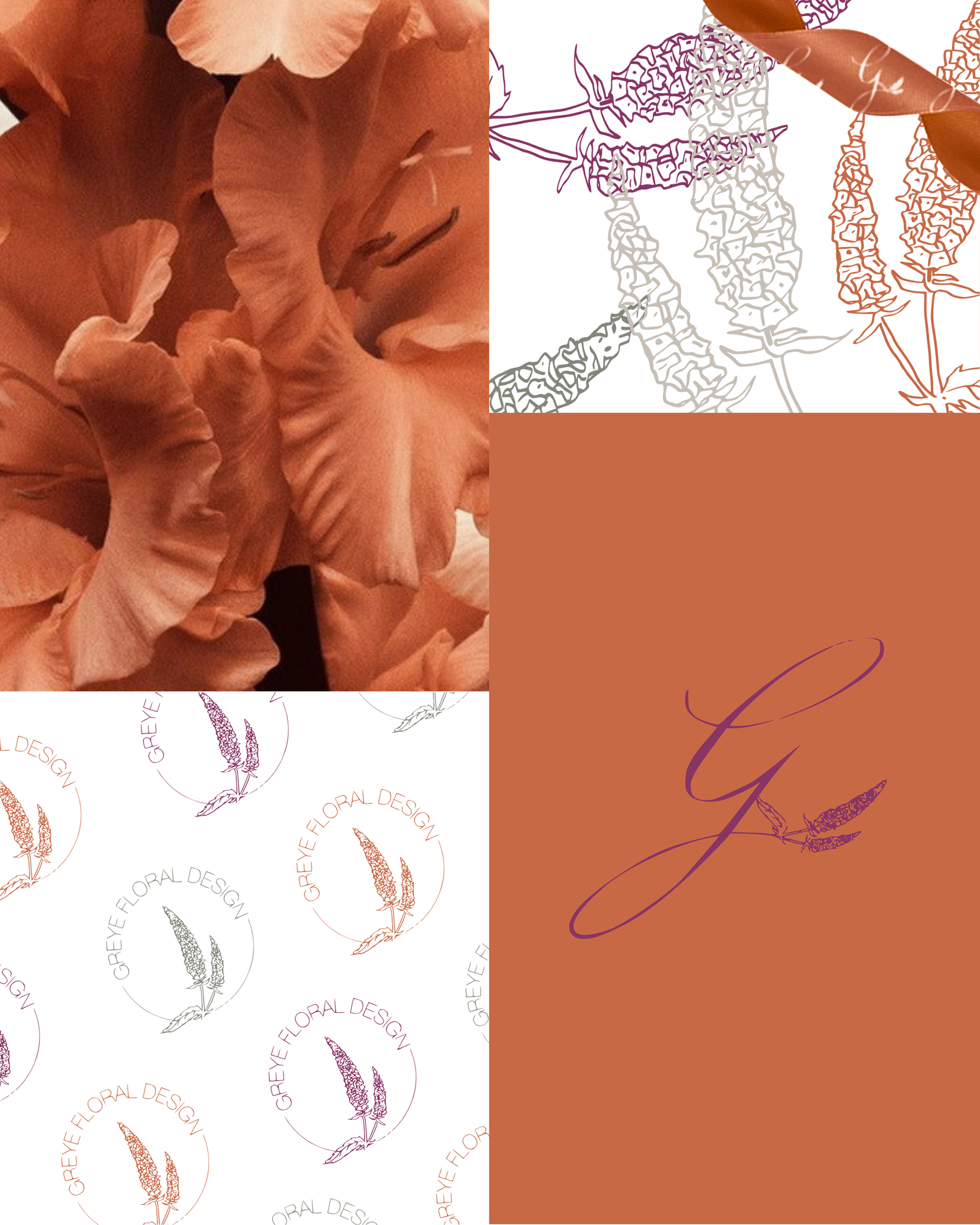
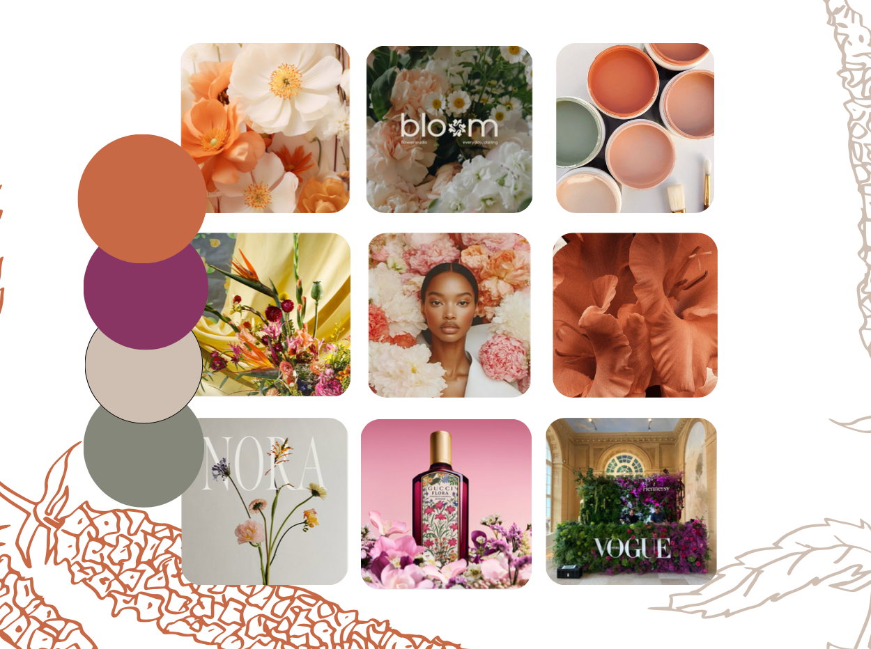
Our creative direction leaned warm, luxurious, and energetic. Erin desired a vibrant, yet clean brand that set the expectation of a tailored approach to florals. The purple and peach tones helped cultivate creativity, peacefully balanced by greye and green.
Visual Refinement
Because Erin’s favorite flower is the Veronica, I sketched a Veronica bloom. I retained the original sketch lines and paired it with calligraphic lettering and clean serif typography to reflect Erin’s intentionality in crafting every bouquet.
Collateral Development
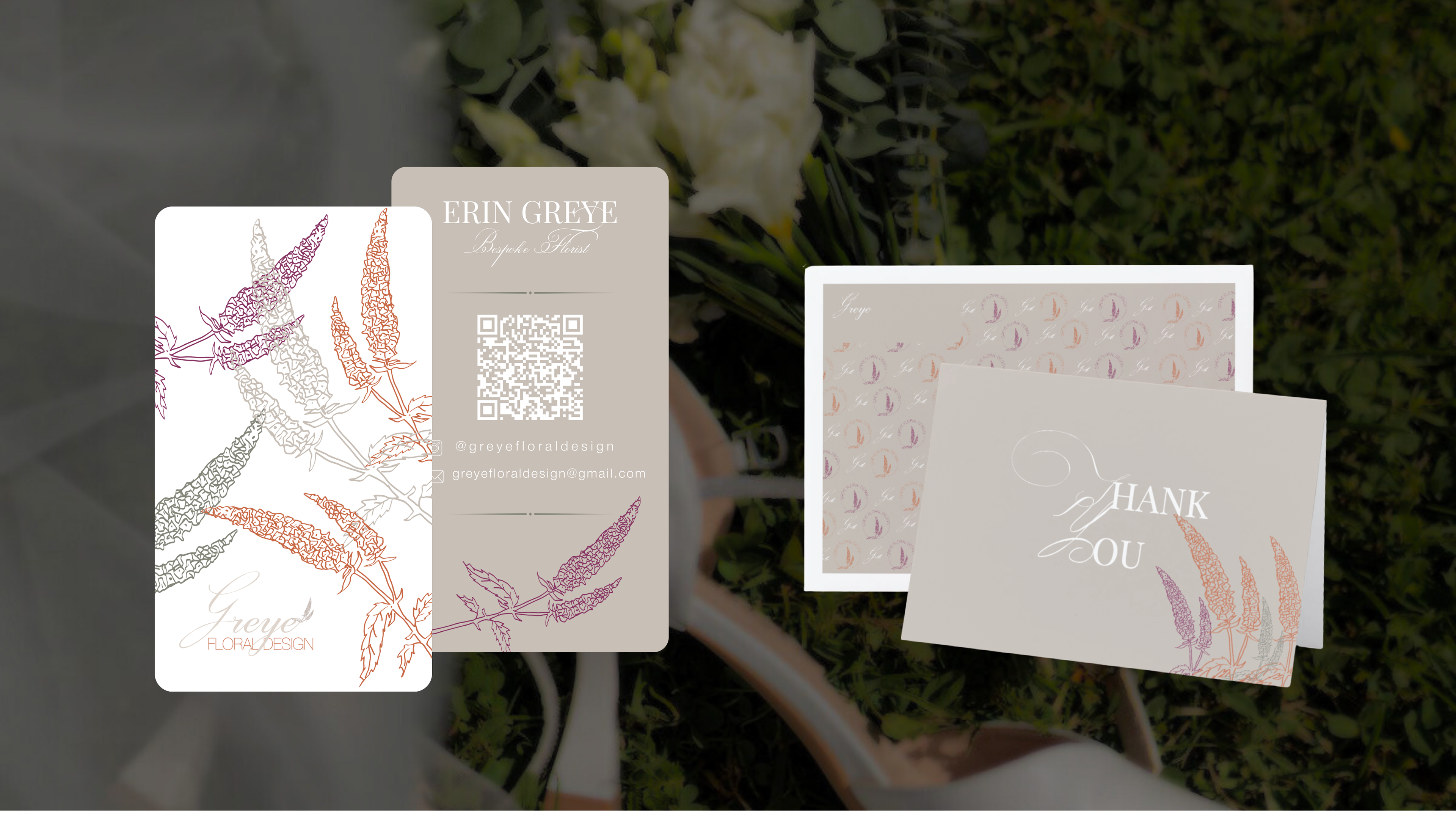
Our tailored mock up and print design bundle features a stationary set, so Erin is able to write handwritten notes to clients, maintaining her goal to provide a tailored floral design service. We also included a new business card and social media kit to ensure Erin’s visual identity maintains recognition from screen to print.